
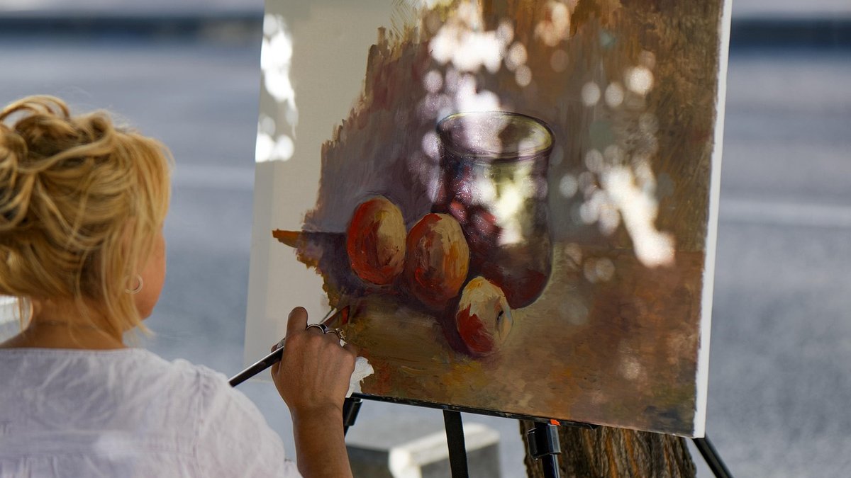
Tone — the relative lightness or darkness of a shape — is what tells the eye where to look and how far to travel. A distant hill reads as distant because its values are lighter and softer than the dark hedge in the foreground, not because it happens to be a different colour. Turn a favourite landscape painting to greyscale and you will usually find a clear, simple structure underneath: a few distinct blocks of value sitting in a sensible order. Turn a weak painting to greyscale and everything collapses into a similar soup.
This matters more in Britain than many painters admit. Our weather gives us soft, wraparound light, long tonal gradients and plenty of grey. Without deliberate value contrast, a Welsh valley or a Norfolk marsh can end up looking like a rainy Tuesday no matter how bright your greens and ochres are.
Most beginners paint what they know is there rather than what they see. Grass is green, so it gets painted green, and the value gets whatever is left over. Add the way a camera flattens contrast and the way a screen lies about shadows, and you can spend hours painting a scene whose structure you never actually observed.
Two habits fix this quickly:
A useful discipline is the three-value study, sometimes called a notan: a small sketch made with only three tones. Light, middle, dark. Not five. Three. The restriction forces decisions. You have to choose whether the cottage wall belongs with the sky or with the road, and whether the trees group together as one dark mass or separate into individuals.
Work at postcard size, no bigger than 12 x 16 cm, with a chisel-tip marker, a stick of charcoal or a flat brush loaded with Payne's grey. Aim to finish each study in five to ten minutes. Do four or five versions of the same view, pushing different shapes darker or lighter each time, then ask which one best expresses the light you remember. That question — which arrangement feels most like that place at that hour — is the whole job.
A good study answers practical questions before you mix a single colour:
Certain errors show up again and again. Painting darks too light is the most common: hedges, shadowed walls and distant woods end up as mid-tones, and the picture loses its spine. The opposite problem is over-darkening everything, which produces a heavy, muddy result and kills aerial perspective. Distance generally means less contrast, lighter darks and softer edges, while the foreground can hold your strongest value jumps.
Another trap is confusing colour contrast with value contrast. A bright red against a deep green feels lively, but if both sit at the same value the painting still looks flat. Test colour mixtures on a scrap of board and check them against your grey scale before they go anywhere near the canvas.
Once the value plan works, colour becomes easier and far more expressive. Decide your overall key first — a high-key painting of a hazy summer morning, or a low-key one of a storm over the Pennines — then keep your mixtures inside the corresponding range. Hold the intended value and you can choose almost any hue: a dark tree mass can be olive, violet or near-black blue and still read correctly. Break the value and no amount of clever colour will save it.
Keep a small sketchbook of grey studies alongside your colour work. Sketch outdoors whenever the light is doing something interesting, and note the time on each page. Over a season you will build a personal library of tonal structures, and you will find that planning light, middle and dark shapes takes minutes but transforms everything that follows.

Hi, my name is Anthony kuber. I am artist and fashion designer.
I love to travel and writing blogging.
Your email address will not be published. Required fields are marked *
Software Developer & Writer
Hey, I'm Diva, a developer and writer blending code and creativity. I'm driven by a deep curiosity and a relentless pursuit of excellence. Join me as I craft digital solutions and captivating stories.


