
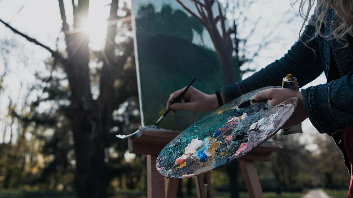
Most landscapes fail not because the drawing is wrong, but because everything sits on the same flat plane. The eye reads a vista in layers, and a painting only feels convincing when those layers are separated deliberately. Before you mix a single colour, decide what belongs in the foreground, what belongs in the middle distance, and what belongs on the far horizon. If the answer is "a bit of everything, everywhere", the picture will stay flat no matter how carefully you render the leaves.
A useful habit is to sketch a three-value thumbnail first — light, mid-tone and dark — no bigger than a matchbox. If you can push those three shapes apart convincingly at that size, the composition will hold together when you scale it up to a canvas.
Depth begins with occlusion. Whatever sits in front hides a portion of what sits behind, and that simple fact tells the viewer more about space than any amount of detail. Look for hedgerows crossing a field boundary, a stone wall cutting across the base of a fell, or a band of trees masking the lower slopes behind them.
When you are out sketching, resist the urge to draw every silhouette completely. Let the near shape bite into the far one. A few practical rules:
The horizon line itself is a powerful tool. Place it high and the sky dominates; place it low and the land feels vast. Either way, keep it clear of the exact middle of the paper unless you have a specific reason.
We judge distance by comparing things we know the size of. A gate in the foreground and a gate on a far hillside are the same object, but one should be three or four times larger on your paper. Get this ratio wrong and the whole scene collapses.
Look for repeated elements you can scale down as they recede: fence posts along a lane, sheep dotted across a slope, drystone walls running up a valley, the windows of a farmhouse. A path or stream that narrows as it winds away will do more for your sense of space than a dozen carefully painted clouds.
If you are working from a sketchbook study rather than life, measure. Hold your pencil at arm's length, mark the height of a distant tree with your thumb, then compare it with a tree nearby. That single comparison will often reveal that the distant tree needs to be far smaller than you instinctively drew it. Squinting at the scene helps too — it strips away detail and leaves the big shapes and their relative sizes.
Air is not transparent. Over a few kilometres it scatters light and softens everything behind it, and copying that effect is one of the quickest routes to believable depth. Distant hills should be paler, cooler and less saturated than the foreground, with weaker contrasts and softer edges.
In practice, that means:
British weather actually helps here. Our damp, hazy air produces wonderfully graded distances, especially in the early morning or after rain. Paint what you see, not what you assume the colour of a distant hill should be.
A landscape needs somewhere for the eye to rest. That might be a lone oak, a gap in a hedge, a sunlit barn, or the bright ribbon of a river turning through the valley. Whatever it is, place it off-centre — roughly on a third line — and give it the strongest contrast, sharpest edges and most saturated colour in the painting.
Everything else must support it. This is the hardest discipline in landscape work: knowing what to leave out. If a distracting bright shape competes with your focal point, tone it down or remove it entirely. Trees can be moved, telegraph poles deleted, an awkward gate shifted two metres to the left.
Think of the composition as a route. Lead the viewer in from a foreground shape, guide them along a path, river or line of light through the middle distance, and release them into the distance. Your focal point is where that journey pauses.
Outdoor sketching is where these skills are built, because the light changes and you have to decide quickly. Take a viewfinder — a piece of card with a rectangular window cut into it — and frame several options before committing. Then work through a small routine:
Twenty minutes of this will teach you more than an afternoon of copying a photograph. Overlap, scale and atmosphere are simple ideas, but they need practising until they become instinct — and once they do, every landscape you paint, from a Cornish cove to a Yorkshire valley, will open up and breathe.

Hi, my name is Anthony kuber. I am artist and fashion designer.
I love to travel and writing blogging.
Your email address will not be published. Required fields are marked *
Software Developer & Writer
Hey, I'm Diva, a developer and writer blending code and creativity. I'm driven by a deep curiosity and a relentless pursuit of excellence. Join me as I craft digital solutions and captivating stories.


