
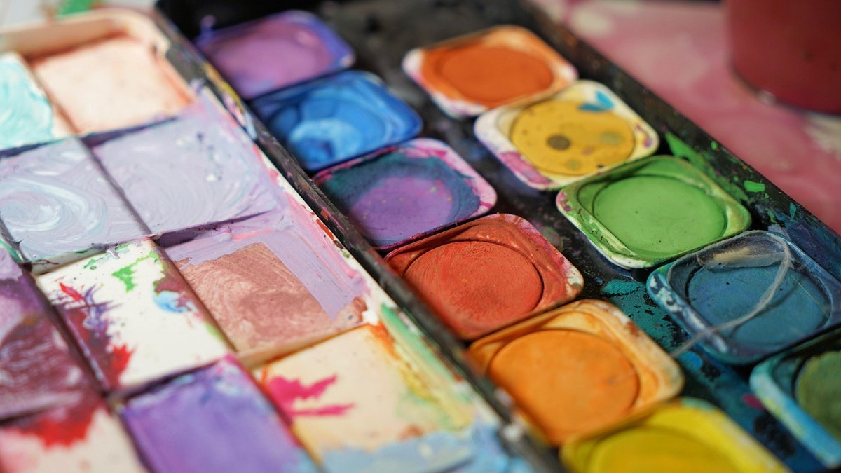
Most of us begin by agonising over paint. We compare pigment ranges, chase a particular granulating blue, and spend a fortune on sable. Then we buy whatever paper is on special offer and wonder why the sky looks patchy and the distant hills refuse to stay soft. In watercolour, paper is not a passive support. It is a co-author. Its weight decides whether your washes lie flat or pool in the hollows. Its texture decides whether you can drag a dry brush across a hillside or lose every crisp edge you attempt.
Landscape painters ask more of paper than almost anyone else. In a single session you might lay a wet-in-wet sky, lift cloud shapes with a thirsty brush, glaze a shadow across a field, and scratch a few dry grass stems in the foreground. Not every sheet can take all four without complaint. Choosing well comes down to three things: weight, texture and the quality of the pulp.
Weight is given in grams per square metre (gsm) or in pounds per ream, the older imperial measure you will still see on imported pads. The conversions are handy to know:
If you are working larger than about A3, or you like to soak the paper before you start, go heavy. Anything thinner than 300gsm really ought to be stretched: soak the sheet for three to five minutes, lay it on a board, and tape or staple it down all round while it is still damp. It dries taut and stays that way. Gummed blocks do the same job without the fiddle, which is why so many outdoor painters carry them.
Texture describes how the sheet was finished. It changes how water and pigment sit on the surface, and it is the single biggest factor in the character of your marks.
Think about what the painting actually demands. A loose estuary scene with a big graduated sky wants a heavier sheet, cold pressed or rough, sized well enough that you can lift cloud shapes out while the paper is still damp. A tight study of a drystone wall or a harbour full of rigging wants hot pressed, or at least a fine cold pressed, and a paper that resists abrasion so you can lift and re-scratch without raising the surface fibres.
Repeated glazing — the landscape painter's bread and butter for building depth in shadow and distance — is where cheap paper gives itself away. Wood-pulp sheets and lightly sized papers start to pill, bloom and lose their bite after two or three layers. A well-sized 100% cotton sheet will take glaze after glaze, still lift cleanly, and keep its colour. Cotton also ages far better, which matters if you intend to sell or frame the work.
Outdoors you have less control and less patience, so favour convenience. A gummed block of 300gsm cold pressed keeps the sheet flat without a board, and you can turn to a fresh page without wrestling with tape in a breeze. A hardback sketchbook of 200–300gsm is lighter still, and toned paper — buff, warm grey, oatmeal — is a quiet joy for landscapes, since it gives you a ready-made mid-tone and lets you work with both darks and whites.
Take a small sponge or a scrap of kitchen roll to mop up rain and drips, and remember that damp air slows drying. On a humid day, a wash that would normally be touch-dry in ten minutes may still be tacky half an hour later, which will ruin your glazing rhythm if you are not expecting it.
You do not need a studio full of paper. Buy a few loose sheets in different weights and textures, cut them to the same size, and paint the same simple scene on each — a band of sky, a distant hill, a foreground tree. Take notes on the back. Within an afternoon you will know which surface suits your hand, and you will stop blaming your brushes for problems the paper was causing all along.
When you find a combination that works, commit to it for a season. Consistency is worth more than novelty: it lets you concentrate on light, composition and colour, safe in the knowledge that the sheet beneath your brush will do exactly what you expect.

Hi, my name is Anthony kuber. I am artist and fashion designer.
I love to travel and writing blogging.
Your email address will not be published. Required fields are marked *
Software Developer & Writer
Hey, I'm Diva, a developer and writer blending code and creativity. I'm driven by a deep curiosity and a relentless pursuit of excellence. Join me as I craft digital solutions and captivating stories.


